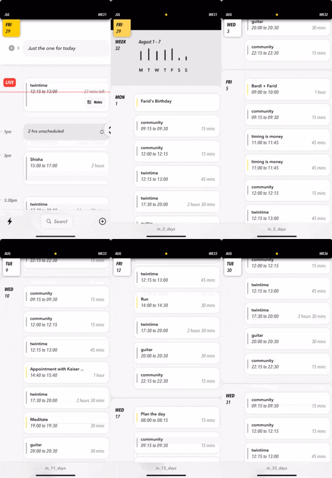
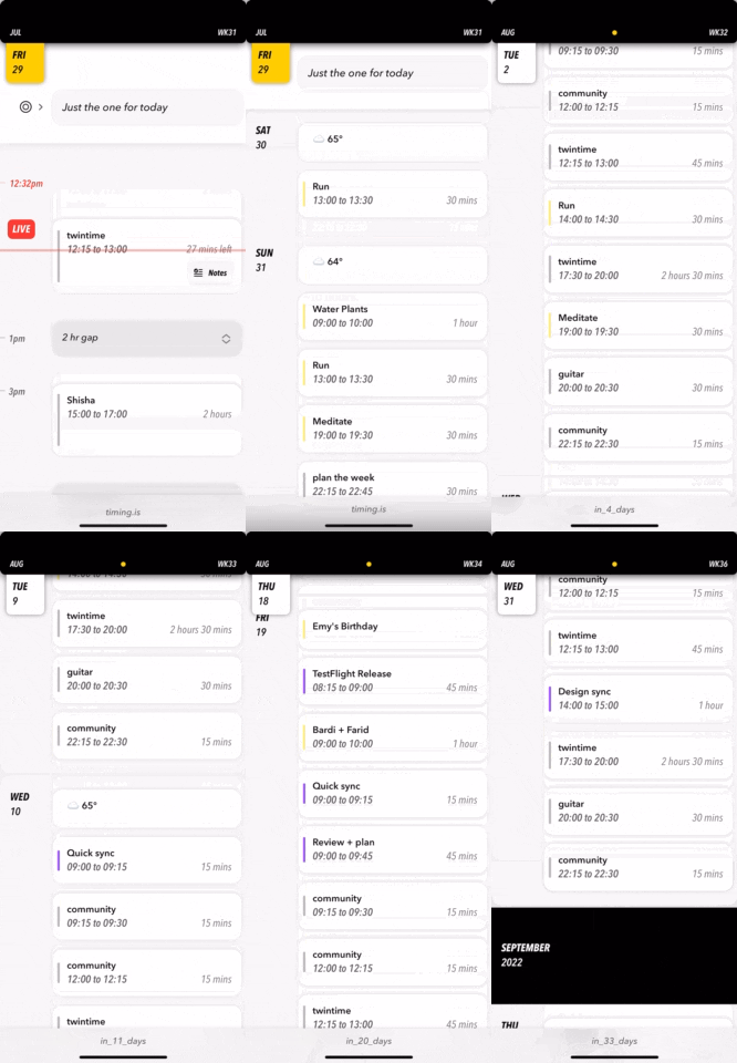
It took a few hours to fall in love with SwiftUI. So much so that we instantly decided to abandon a cross-platform codebase and go fully native on iOS. timing.is shipped this month on the App Store. It was built entirely in SwiftUI. Its development took several months. It would have been less if SwiftUI just gave. Unfortunately, repeatedly it would take. (To add more context, the app was available on TestFlight halfway through its development. The iteration based on user feedback equally contributed to our timelines.). Towards the latter stages of development, we even re-considered our decision to go with it. At the end, we didn’t drop it for a couple of reasons. We were too deep into the process. Being a bootstrapped operation that was already severely behind schedule, we couldn’t afford to restart. But this wasn’t mainly why. Despite the regular friction, we still loved it. Because like any commitment, you must let the majority rule. It was fun at least 51% of the time. But let’s talk about the <= 49% that wasn’t.
First things first, let me be clear this is not another “Is SwiftUI ready for production?” hit piece. Because let me be even more clear: IT IS! Of course, in our opinion. And our opinion was based on satisfying highly complex requirements (calendars are fundamentally simple, but we didn’t want to build just another that contributed to digital waste). In other words, if you’re building something remotely conventional and/or with minimal stress load, then I wager it will be fun more like 98% of the time. We managed at the end, but there were compromises made. It could — and really should — have been easier, especially considering SwiftUI has had three major updates since it was announced in 2019. Because, as you’re about to read, the problems we had — unlike our needs — were relatively basic.
Disclaimer: it is entirely possible some of the issues we faced have solutions we are unaware of. But we’ve looked and tried to no avail. This however highlights an important point: these fundamentals should just work.
ScrollView to Hell
Okay, deep breath. This was the control that we wrestled with the most. An infinite scroll is expected in a calendar app. Executing this was relatively straightforward, but only moving forward in time. Because trying to load items on demand scrolling up resulted in a noticeable jitter. I asked on StackOverflow, and 2k views since, it’s apparent there’s no native approach that works. I actually raised this in a WWDC lab with a SwiftUI engineer last year, and their recommendation was to 1) create a LazyVStack with a ridiculously large data set in both directions and 2) scroll to today onAppear. A creative workaround, except unfortunately scrollTo behaves unreliably inside a LazyVStack. It would usually not even come close to the intended target, occassionally missed it by a little, and rarely correctly. We were lucky to eventually find Marc Palmer’s excellent piece “Is your SwiftUI ScrollView scrolling to the wrong location?”. This was the catch:
Eventually I isolated it.scrollTo(id ...)does not scroll to the frame of the view with theidif you have aForEachin theScrollViewand the result of theForEachbody for the view you want to scroll to contains other views.
Like, seriously?
Implementing the advised changes helped, but still wasn’t reliable enough (we would stress test the experience with a really busy calendar). Reluctantly, we had to re-design to accept reality: from the Agenda view, currently you can’t go back in time unfortunately.
In these situations, you have three options: fight, concede or re-evaluate. We were stubborn and battled relentlessly. Our advice is to timebox a fight, and don’t delay a clear outcome. It’s recommended you use the constraint as an opportunity to re-design so that as far as the user is concerned, the limitation is never felt and — actually — you’ve made it feel intentional! That’s what we intend to do when we introduce retrospective elements to the product.
Unfortunately SwiftUI’s ScrollView had other pain points rooted to its inability to gracefully handle competing gestures, i.e. scrolling may be disrupted due to hijacking gestures or vice-versa. For example, we wanted each calendar item to be tappable and long-pressable. This worked out of the box, except the onLongPressGesture’s minimum duration was being ignored. It was frustratingly slow to open. No clean solutions existed. Fortunately, Daniel Saidi recently persevered a solution: his ScrollViewGestureButton performed magic tricks using a stealthy ButtonStyle. Similarly, our Day screen consists of a horizontal pager consisting of multiple adjacent vertical scrollviews. For a scroll and swipe to work simultaneously, Ciaran O’Brien ingeniously also used a ButtonStyle to create an artificial delay because there’s no equivalent of UIKit’s delaysContentTouches on a UIScrollView.
Besides ScrollView, we regularly faced battles with performance and state. Admittedly, our troubles were more likely self-inflicted. We depend heavily on Observables. As a result, it is so easy for an app of moderate complexity to experience issues if your architecture is not rock solid. Views will refresh unnecessarily. And in a calendar with an infinite scroll, this will lead to noticeable slowdowns. You’re always literally one @Published property away from triggering one. Martin Mitrevski’s SwiftUI performance tips is a must read when it comes to the topic. Recent tweets of wisdom from Oskar Groth also resonated. Our approach no longer defaults to carelessly creating Publishers and is much more considerate:
- If a view must refresh after a specific property’s value is changed, then consider giving it a
@Publishedproperty wrapper. - Proceed with the
@Publishedassignment if there are no other properties that may be changed simultaneously that also demand a view refresh. - If there are, then instead determine if there’s a more consolidated approach to announce a change. For example, a separate Publisher whose value is changed once the activity causing the object’s properties to mutate is complete. Or Martin’s suggestion to
objectWillChange.send()at that point.
Similarly, what makes an @EnvironmentObject a convenience is what makes it a nuissance. If a view refers to any, make sure it needs to respond to every publisher change contained within them. If they don’t, then consider replacing the reference to a new object that it’s fully associated to.


In general, if you got yourself in a pickle — like I did several times — don’t do what I did every time: just as I naively set unnecessary/non-optimal publishers to begin with, I foolishly thought the opposite — removing any that seem unnecessary — is the way to go. Before you remove any, study the property’s trail. I had a few examples of a removal not immediately having any visible consequences, only for it become apparent after some time when the view didn’t respond to changes in a specific scenario. Finally, in case I forget again, remember an @EnvironmentObject will trigger a view update even if the view has no reference to any of its properties. An inexpensive way to determine unnecessary redraws is by setting the background colour of a view to Color.random, a clever trick by Peter Steinberger.
An honorable mention goes to TextField. Just a few fresh examples of run-ins we had with it are:
1) we wanted to move our entry UI to open in a sheet and with immediate focus on the title TextField, but there’s a noticeable delay before the keyboard pops up. So we didn’t.
2) we support typing a new entry and hitting [Next] to add another without losing keyboard focus. A new bug in iOS 16 means when you do, the keyboard begins a close transition before sliding back up to position. This one is in the current version, because we decided dropping the ability to add consecutive items would bother users more than this UI hiccup. In the meantime, we’re searching for a workaround because we’re not expecting a fix till the summer at this point.
3) when you are editing an entry, we want the title field’s cursor position to be at the beginning. But, alas, not possible.
Despite all of the above, we remain committed to and in awe of SwiftUI. We’re experienced enough to not allow moments of frustration — however regular — to cloud our judgement on the overall experience. Considering our setbacks don’t relate to obscure requirements, we’re confident they’ll eventually be ironed out. However, we’re less certain when. In the meantime, whenever we hit an obstacle, we’ll keep a good fight (:
timing.is now available on the App Store. Made with love (and occasional despair) in SwiftUI.
Follow me on Twitter @mtrostyle and/or Mastodon @bardi where I’ll be sharing more on timing’s SwiftUI developments.

