
There’s been a renaissance of calendar apps lately. But — like every indie app origin story — none scratched our itch, and so we began building our own. Eager to make an impression, we leaned heavy on design. The objective was to build something memorable, that would shine in a calendar line-up. If we looked and felt like every other calendar, we became just another. And what’s the point really? So we took a lot of liberties. I mean a lot. This was most apparent within navigation.
We wanted to achieve a couple of things with timing’s design:
1) minimise user’s cognitive load
2) optimise for one-handed mode
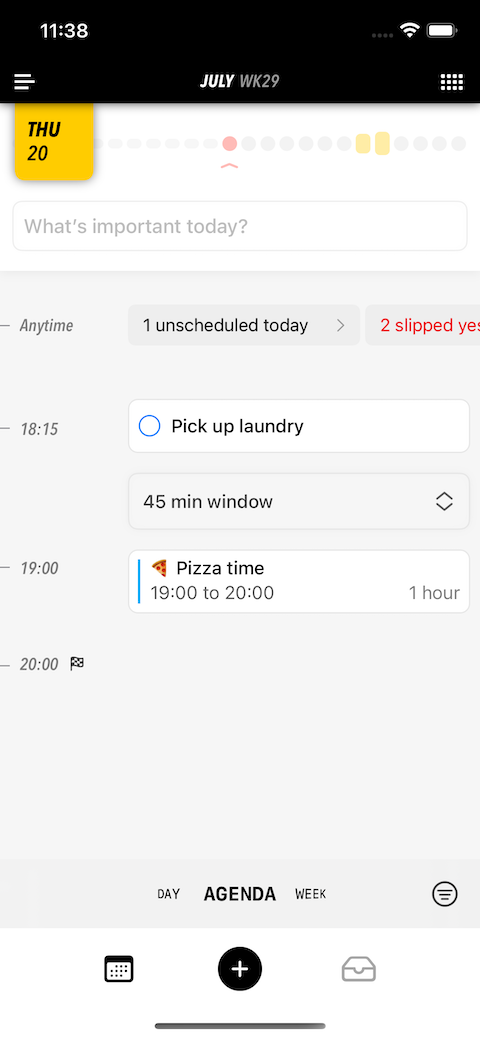
For 1), we didn’t stop iterating until we cracked it: the entire app was eventually streamlined into a single screen 👏 It’s a calendar, right? Any more screens and you’re adding inessential complexity. 2) on the other hand was more straightforward. Steer as much of the UI to the bottom-third. A conventional tab bar was incompatible with these requirements, and so we got creative. This was the result:
We packed a lot of functionality in a compact space. The bottom left icon was our (old) icon that opened the app drawer. On the opposite side was a viewfinder icon to change the currently selected view between agenda, day etc. The group in the middle were the core actions: 1) filter changed what’s visible based on specific criteria, 2) create to add anything new and 3) plan is where you could schedule overdue/unscheduled tasks from. This was it in action:
We were feeling good. It made sooo much sense... to us (: Observing our genius in other people’s hands presented a harsh but much-needed reality check. The biggest form of stupidity in design is possibly re-inventing the navigation wheel. If a new user doesn’t feel comfortable and can’t find their in-app bearings almost immediately, expect a confident uninstall.
So let’s identify the many issues that made us re-evaluate our priorities.
- We had a questionable icon (since corrected) that was impacting App Store conversions. But to then use it inside the app instead of a more common symbol associated with an app menu was counter-intuitive. Making things worse is where we positioned it as well. Some never got to our settings screen.
- The viewfinder was a cool party trick. It was clever too. Inspired by the Camera app, we positioned it as the interface to switch the lens attached onto the calendar. Tapping on it would toggle between the two main views (day and agenda), whereas a long press gave you access to all the other views through a rotating dial (week and month). But to make certain views inaccessible unless you were in the know meant these were missed by many. And for those who figured it out, it was still tedious. It may have felt satisfying the first time, but a simple and common action demands a light interaction. This was adding unnecessary bloat for show.
- We thought people would understand the viewfinder’s purpose because of the Camera app. But that’s another category of app. This was a foreign concept to a calendar. Clarity facilitates confidence. The symbol + text combo was obscure. You don’t want the user to need to interact with UI to learn what it does. It should be obvious at a glance. This is sometimes difficult but when the solution is clear, then you must have a really good reason to ignore it. Ours was not — we had imposed unnecessary (artificial) space constraints. When an interaction is important, give it the room it deserves.
- We mastered over-thinking our solutions, and prioritised abstract concepts over actual interactions. Users don’t think (or care) about the why. They want to know how. Although grouping actions made sense, the problem was they each behaved differently. One opened a compact overlay, another a form sheet and the last literally flipped a switch (more on this in a bit). Predictability in design is an underrated characteristic. Sibling UI are expected to share common physical traits.
- The most popular action — [+] — was sandwiched between two lesser known ones. This was in a non-optimal location to not just touch (mis-taps were not unusual) but to recall too (indistinct appearance and unconventional spot). Design is trade-offs. And we were making the wrong set. We were promoting two other generally un-tested features to be of equal importance at the expense of [+]’s ergonomics.
- When you hit [Plan], we didn’t want it to feel like you were being taken away to another screen but that you had activated a mode within. So we made the bottom actions be consistent once you switched. [Plan] was replaced with [Browse] to toggle out. Clever, right? Obviously not. We observed so many struggle to find the exit because there were no explicit cues to return. This one hurt because we were really attached to the idea that planning is a state and not a screen.
- Did you know you could pull the top black section down to show a conventional month calendar? Neither did most users. Confirmed: Rounded corners and a shadow effect are insufficient affordance.
Going unconventional makes your app vulnerable. Even for users patient enough to figure things out, remember you’re one of many apps they depend on. And so there’s always a switching cost into your app because it does things differently. The question we asked ourselves is why. Why were we different.
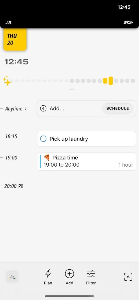
At this stage, we were still focusing on building the calendar fundamentals. And so our feature sheet didn’t boast any noteworthy differentiators. If we can’t innovate on utility (yet), then let’s with design at least. Except we didn’t appreciate wrapping the basics in an unfamiliar package is ironically counter-productive. So we ripped apart the navigation, and went back to basics. Our requirements this time around were more direct: everything needs to be obvious, especially to the untrained eye. 15+ updates later, this is where we are today:
- App menu icon and location in the conventional top left.
- You can still drag the top down, but there’s now an icon in the top right to bring it down too.
- All views are listed by default.
- Filtering is more of a power user feature, and so its location and size were demoted accordingly. And its icon changed to a boring (recognisable) filter icon.
- [+] is front and centre.
- Planning previously surfaced things that were not scheduled. What universal concept could it be repurposed as? An inbox of course. A calendar for all your scheduled items, and an inbox for everything else. Perfect.
The noteworthy trade-off with the above changes was the content area was reduced in size — not by too much — to make room for a second level of navigation. As a result, the app is more bottom-heavy. Not a big deal when you consider what we gained in return. We — like many others in the pursuit of cleaner interfaces — miscalculated minimalism: it’s not about less, but the essentials.
At the beginning of this process, we were concerned by how much needs to change for the experience to be objectively better. By the end, we were relieved by how relatively inexpensive the refinements were. And how we still managed to blend general convention with our original perspective. Simple is difficult to achieve when your understanding of the problem is shallow. But time deepens your awareness, and this is when simple becomes obvious. This is only possible if you’re prepared to listen. When these unpleasant conversations surrounding navigation with users first happened, we were in justification (defensive) mode. It’s okay to explain. It’s understandable to push back. But don’t let the past dictate your future. Humility accelerates progress. Be humbled and stay humble.
timing.is now available on the App Store. Made with love (and occasional despair) in SwiftUI.
Follow me on Twitter @mtrostyle and/or Mastodon @bardi for more frequent development updates.